Feeder, User Activation
2023
Client - Feeder
Year - 2023
My Role - UX & UI Designer
Project - This is a project I did at Technigo in collaboration with 4 other students.
Brief - For the brief, we got the task to help Feeder improve their funnel from acquisition to activation, and to do this by studying their current onboarding and find a solution to increase the activation rate.
Summary - In the end we created and presented a new onboarding process and could based on our research predict that if our changes were to be implemented that Feeders activation rate would increase with about 20% and ultimately double their current revenue.
Research
We started this project by researching feeder, what their business idea is, how to use feeder and what a users first impression is. We also did benchmarking, looking at what other companies in the industry do to activate their users.
What is Feeder?
Feeder works like a mailbox but for news.
As a user you can add content sources to get your own customised news feed. Feeder then tracks these sources and bundles it into an easy-to-digest reading experience. It is a way for the user to stay up to date with what is relevant to them.
Every update from one of your sources will be sent to your feed faster than you could check for updates manually. And by having all information in one place you can save hours on looking for content every week.
Benchmarking
Here we were looking at other SaaS companies, what their onboarding looked like. What we thought worked well and what could be implemented at feeder. We found that an interactive onboarding experience has become common. This sets a certain expectancy on consistency and standards.
Current Onboarding
Next we looked at feeders current onboarding. It actually wasn´t much to look at. Going from their home page, to creating an account and finally using the application the only step the user experiences as an onboarding is entering their personal information. In other terms the user enters this brand new application with no knowledge of how to use it. The only explanation they provide for the user is a collection of about 20 videos which are very hard to understand or follow along. In the end we could see that the reason that feeder had such anlow activation rate and loosing their new users is because of the high cognitive load their current onboarding process requires from their users. Feeder has also chosen to put their notifications behind a paywall which makes it hard for users to remember to come back to their application.
New Onboarding
Goals and method - The goals for our changes is to lower the cognitive load of the user when they sign in for the first time, and to increase the perceived value of the user’s account, and by doing so, increasing the day 2-30 retention rate.
Our methods for reaching these goals comes from studying the User Heuristics as presented by the NNGroup, and UX Psychology principles from growth.design, and through benchmarking against other online services. We have also taken inspiration from parts of Feeders existing UI and Design system, making sure we stay true to the brand.
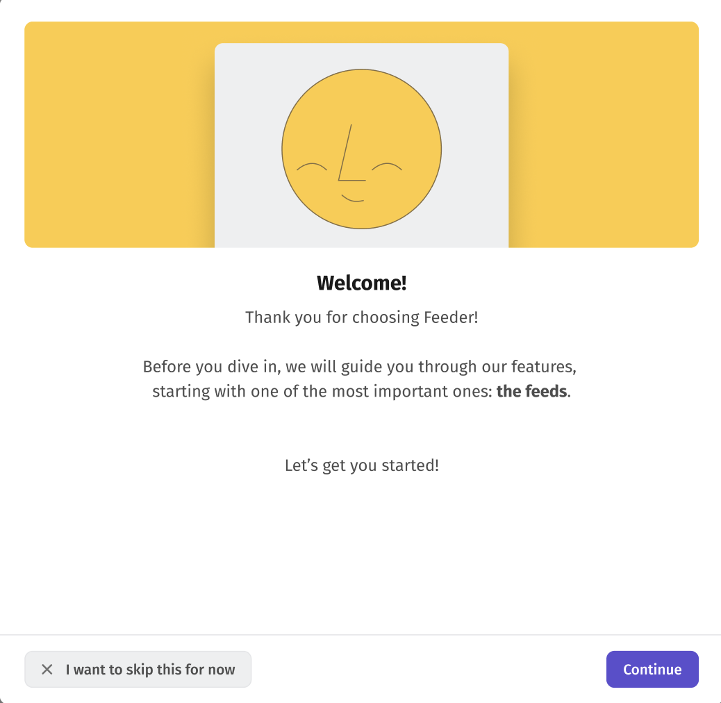
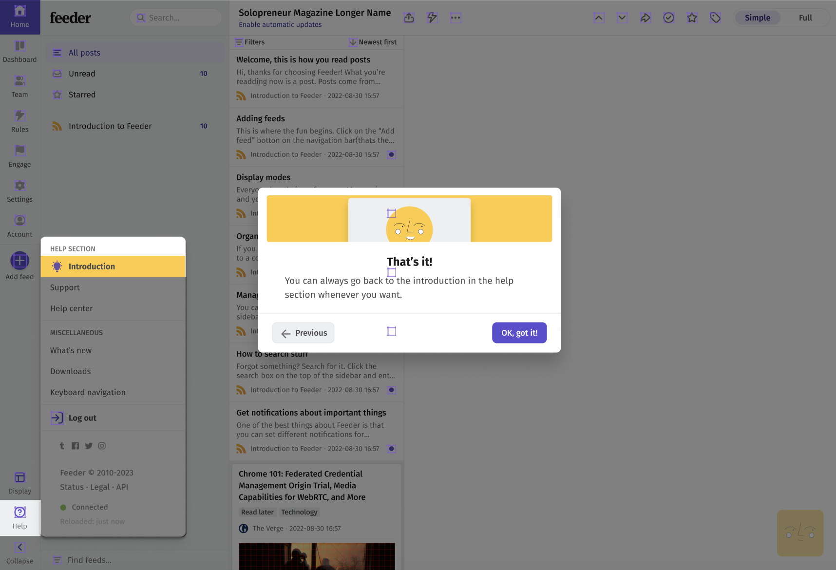
By implementing our findings, we can introduce new users to the features of Feeders in a way that is recognisable across the industry (adhering to user expectations) and is easy to digest - this lowers the cognitive load significantly by chunking information, showing the user one or a few features at a time. All while being gently guided through the service, they get to customise their content and will get an understanding of what to expect after the onboarding process is done.
Hard Onboarding
By guiding users to select a few feeds at the onset, they become more emotionally invested in their feed from the start, instilling a sense of ownership and commitment, or the endowment effect as per the ux psychology principles . Additionally, this approach reduces cognitive load by allowing users to experiment with a smaller selection of feeds in a controlled environment, ultimately easing the pressure when they later seek to add more feeds to the app independently.
This concept continues when guiding the user with the modes and themes.
Before leaving the user to the soft onboarding, the user is shown the different areas of the “mode” using a high contrast to guide their field of view and is also told what they do. This is to slowly introduce the user to the interface, and in turn lowers the cognitive load.
So the focus of the hard onboarding is to lower the cognitive load by slowly introducing the user to the main features, by increasing the value of the users account.
Soft onboarding
The soft onboarding is drawn out and is based on nudging the user into the last features of Feeder. Tips appear after certain conditions are met, like if the user add 3 additional feeds, they are told about folders, or when going to the unread tab, they get asked if they want to turn on notifications.
The focus here is to also lower the cognitive load by slowly introduce more features when needed to the user, and to nudge them to try these features out.


